Admin Details
Maggie Deng, Founder of Yellow Fellows
Purpose, goals, and audience
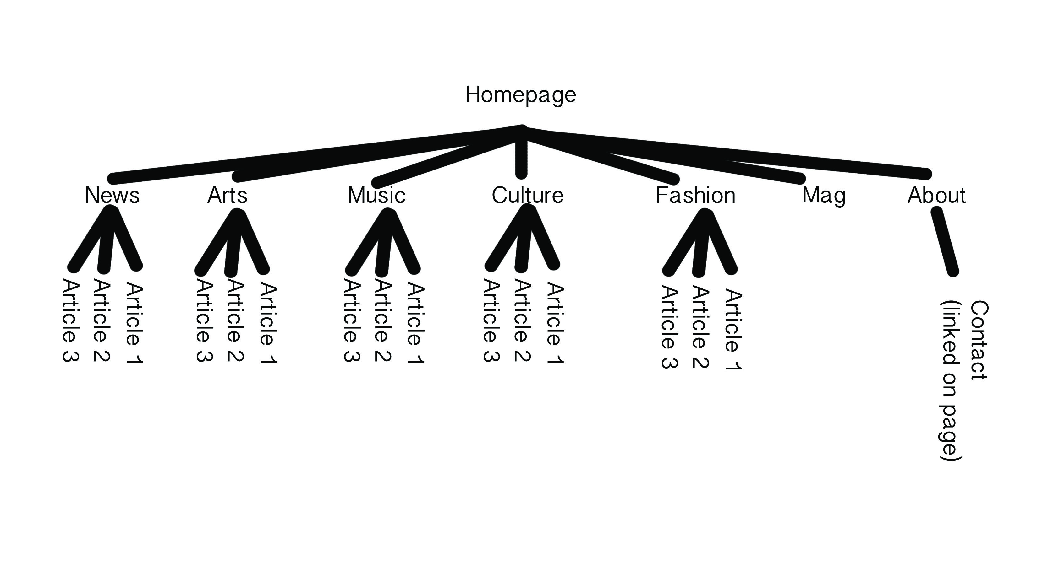
Yellow Fellows is a media platform, staffed entirely by APIA, reporting on fashion, culture, news, music, art, and magazine. It is meant to be a place for APIA to express their perspectives on popular culture, art, their own personal experiences, etc. Their audience is open to anyone who would like to read the content they put out, however, may have a slight bias towards members of APIA community.
Page Layout and Appearance
- The yellow title is a placeholder for the logo
- The navbar is not fixed and lies approximately 220 px
from the top of the page. It’s black (#000000)
with subcategories evenly dispersed with white font
(Roboto Bold 700 30 pt). It is 45 px in height
and spans the whole page.
It will have one drop down menu as seen:
- There is no footer at the moment (though this may be added on later.)
- The social Icons bar is fixed about 50px
from the bottom of the page on every page
(not every mock up has the fixed bar,
given the nature of the
longer
sketches which don’t necessarily reflect what the viewer is seeing, see general homepage and about). It is black bar with yellow icons leading to their respective sites (these accounts haven’t been made and the linkedin one will not be there, we simply put in dummy icons until Maggie can provide us more info.) It is 60px in height and 425 px in width. It touches the edge of the right screen.

- In general every page will have a white background.
The content will exist in a gray box (#000000 10% opacity.)
The gold used in any capacity, font or div color, is always #FFD24C.
The homepage best depicts this.
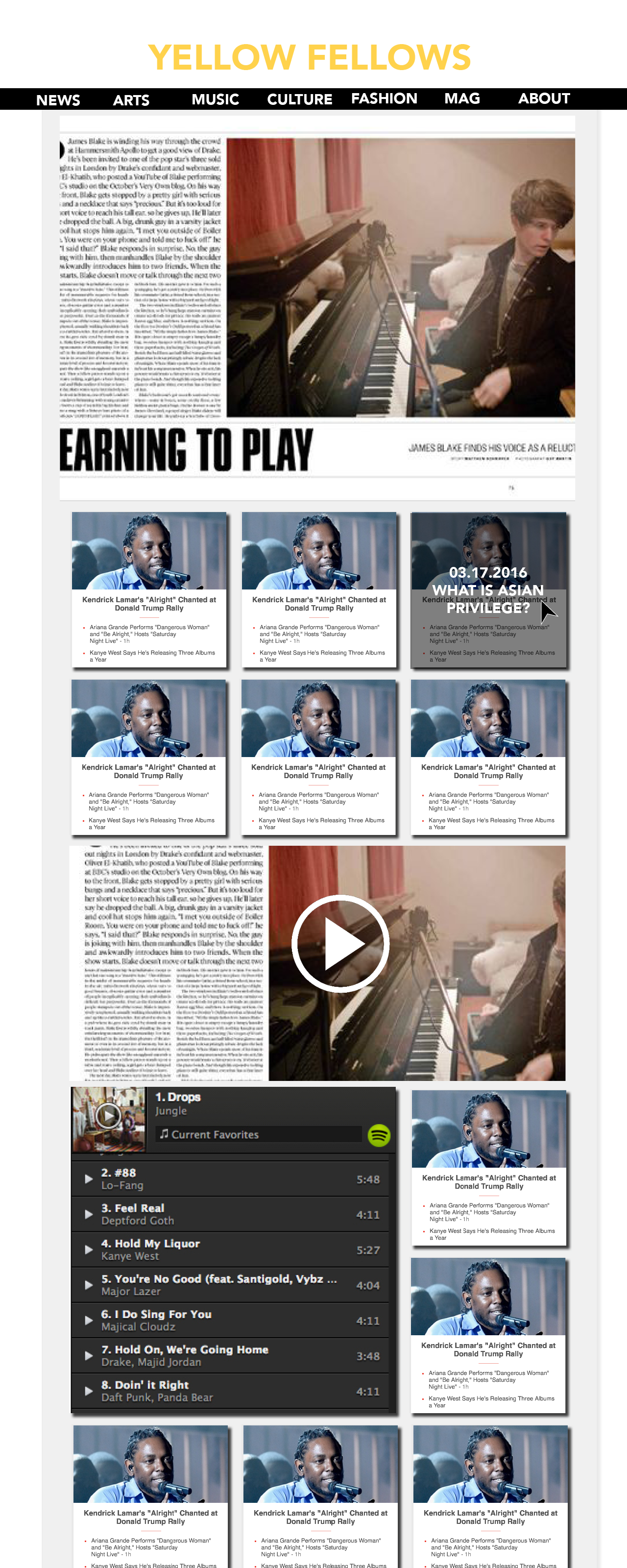
- For pages with thumbnails (general homepage.jpg and), the “title” specific category.jpg) featured in the thumbnail will be Robot Bold 700, 14 pt. The “body” will be Roboto Normal 400, 12 pt. The mock up at the moment has a dummy image.
- As for actual article pages (click on content.jpg) the title of Article Roboto Bold 700, 72 pt, the date in the yellow box is the same font, 30 pt. The text for the article is Robot Normal 400, 24 pt.
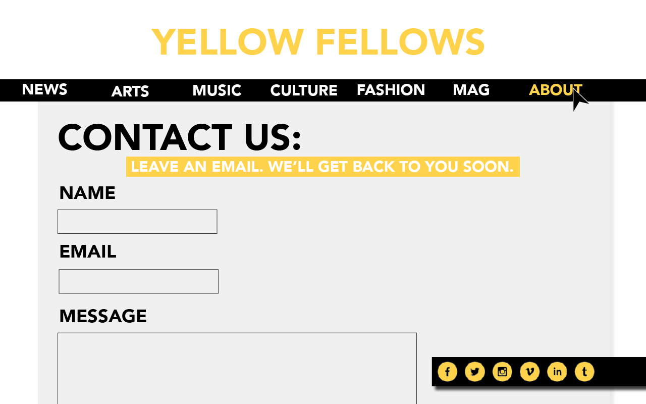
- The contact us page (form.jpg) will have a title of Roboto Bold 700, 72 pt. The headers of each line the user has to fill out will be Roboto Bold 700, 36pt The subtitle in the gold box will be Roboto Bold 700 30 pt. The text boxes will have a 1 pt solid black border with no fill color.
- The about page will have a title of Roboto Bold 700, 72 pt. The headers of each line the user has to fill out will be Roboto Bold 700, 36pt. The subtitle in the gold box will be Roboto Bold 700, 30 pt. If you hover over a speech bubble drops (#000000 80%.) The font is Roboto Normal 400, 14 pt, white.
- Links on any page will have the same text as its parent element , but underlined. When clicked upon, the link will turn into the gold specified earlier.
- Please refer to the specified jpegs for a better idea of the layout. We wanted ot use a large font for means of readability and accessibility. The great contrast between all elements and the use of drop shadows allows for the reader to distinguish between all the main elements on the page. There is also a sense of unity by using the same 4 colors: yellow, gray, white, and black.
Homepage
This is the main hub for all the content for the site. It should display all the content, emphasizing more substantial works produced by the staff. At the top, there is the interactive PDF/online magazine that will automatically flip through all of it’s pages. Underneath that will be thumbnails for articles throughout the month and other content, such as videos and playlists. The general homepage makes all the recent content on the site accessible. For this reason, this kind of design will be somewhat emulated by each of the specific categories; however, each category will also be highlighted in the navbar while on that page. See the previous example to see the full HTML mock up. Here is a fixed version of the page (also note, this fixed page displays how the hover over function works in changing about from white to gold).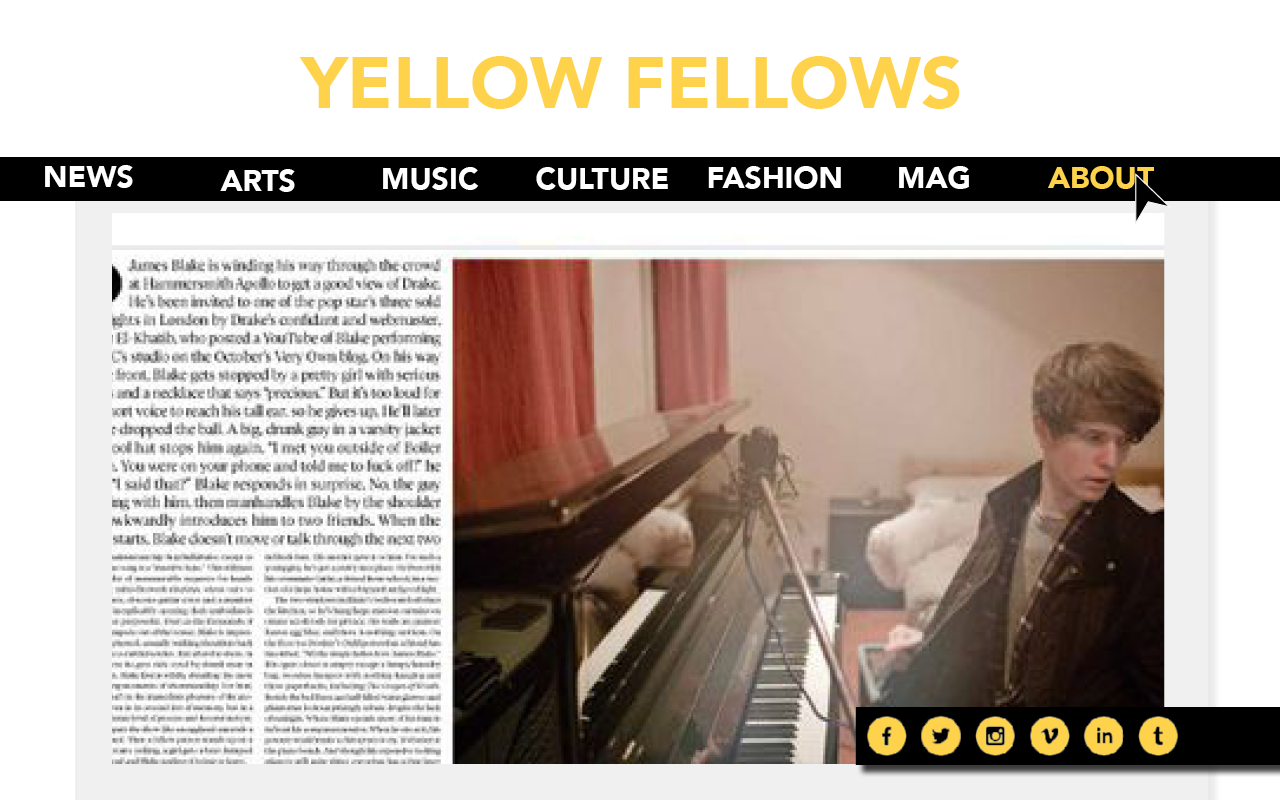
Article
This is the basic structure of all content on the site. The graphic/illustration/video will span across the top for accessibility (as always.) The text below will follow the structure of Title, Date (bottom left), and by lines right next to it; the article follows. This structure is ideal since this is the required information to be considered to have Associated Press style content on the platform. The only exception to displaying the media at the top, spanning across the screen, would be an embedded playlist, which would then float left in the body of the text.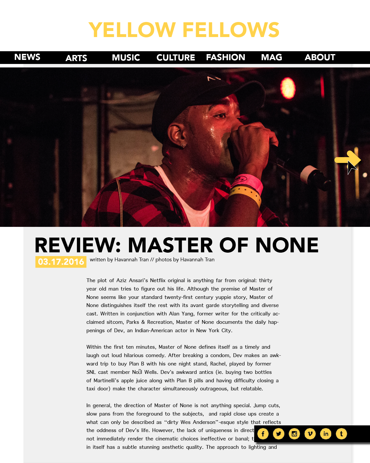
About
The about page has a similar format to the click on content page in regards to titles, subtitles, text, etc. The main difference may be the thumbnails that appear underneath the description of the media platform. With each thumbnail, if a user hovers over the photo of the staff member, a gray box will appear with more information about that person.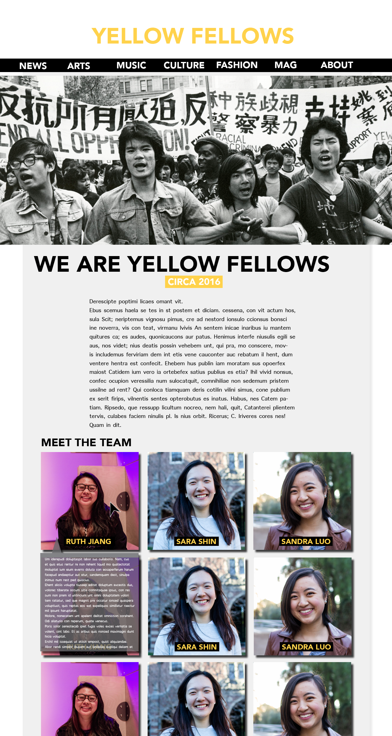
Contact
The contact sheet will be a form that users can fill out with their inquiries that will be messaged to Maggie. Refer to the previous section for design elements. There will be three required “fill” sections: name, email, and message. When the message has been sent, an alert box will pop up thanking the person for their message; something to the effect of:Thank you for your message and we’ll get back to you soon!
Subcategory
The subcategory page will be a subset of the general homepage, in that it'll simply feature the articles in the same way as the homepage, but only the ones relevant to its category.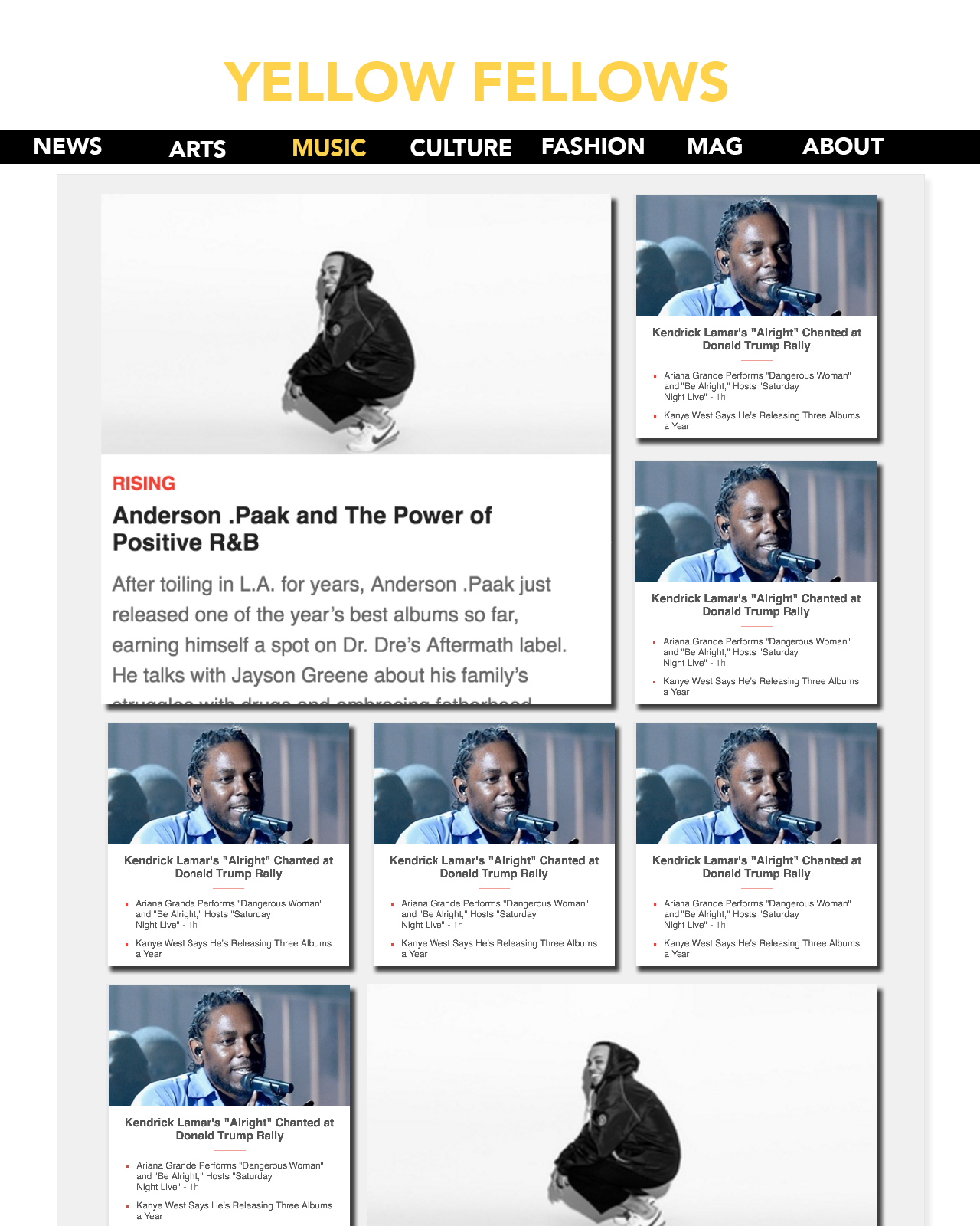
Minimum Requirements
- There will be a drop down menu under
the
about
subcategory in the navbar. The only drop down will be the contact tab, which will lead to the form.jpeg. Havannah will code this. - On some articles, there will be a manual slideshow (probably music reviews.) The clicked on content.jpg page has a yellow arrow on the right side, signifying that the user can look through other photos; after the user clicks on the right arrow, a left one will appear as well for them to go back. Havannah will also code this.
- Spreads of the online magazine will cycle through an image carousel automatically. Carey will code this.
- The contact.jpeg form will be made using Ajax; the result will be emailed to Maggie. Carey will also code this.
Plan
Havannah will finish the homepage on April 1st.
It's important this is done early because all basic
design elements stem
from this (ie. background color, layering, etc.) Along with this homepage, Havannah will make
the navbar and fixed social media bar.
The homepage will also be used for each subcategory's page (with article thumbnails.)
These subcategories will be done on April 22nd, after all the article pages are finished. Carey will do these.
All articles will stem from the same article template
.
Carey will make the template by April 8th
The article pages will be as follows (all html/css done, no JS by the due date)
- DOTA 2
- Courtney Barnett
- The Casting of
Iron Fist
and the Kung-Fu Asian - Fashion feature
With this template, Havannah will put all the appropriate content into these templates. This will be done by April 15th
The mag subcategory is interesting in that it's simply an interactive PDF on a page. Havannah will do this by April 15th
All HTML/CSS should be done by April 19
Subsequently, the JS should be done April 22nd. It's up to both partners separately to decide when they should start given that as of right now (as of 03/15/18) we don't have the skills to begin to work on these JS applications, but we will have learned everything possibly by the 22nd.
