Acknowledgment
This lecture was prepared by Gabriela Lanza '14, a long-time tutor for CS110, MAS major, and passionate website developer.
Usability
This semester, we've learned the nuts and bolts of web design: HTML, CSS, JavaScript (and we'll learn jQuery starting soon). You also recall that, early in the semester, you had an assignment about human behavior patterns related to design. This falls generally under the umbrella of usability, or user-centered design, which according to usability.gov means designing your website so that users can effectively, efficiently and satisfactorily achieve their goals. We return to that topic today, which is particularly important as we prepare for implementing your websites.
Schneiderman's Eight Golden Rules of Usability
Usability isn't an easy thing to master. There's no magical formula that you can follow to make your site user-friendly. There are, however, some guidelines that will make your site much easier for your users. These rules are based off of user interface design (such as interactive applications), but can easily be adapted to websites:
- Strive for Consistency - Keep your design consistent across pages. Users will be confused if your website follows one design pattern on one pages and another design pattern on another page. Keep your navigation bar, the way your links look, your text size, etc. consistent.
- Cater to Universal Usability - Your website should be easy for people of all ability levels to use.
- Offer Informative feedback - If your website has interactive elements, such as form submission or an AJAX back-end, make sure to inform the user what your interface is doing. Has the form been submitted? Has the information been saved successfully? If you were the user, what would you like to know?
- Design Dialogs to yield closure - This rule is more important for user interfaces than for more static sites, but still applies in situations like in Rule #3.
- Prevent Errors - This is one of the hardest to master. It involves stepping through the process that users take to achieve tasks on your website, and thinking about where on your site users might become confused. User testing can help illuminate some of these problems.
- Permit easy reversal of actions - Don't let a user get lost on your website. Make it easy for them to get back to whatever page they came from.
- Support internal locus of control - This rule is similar to Rule #6. Make sure your users always know where on your website they are located. A map of the sequence of clicks taken to reach their current page (i.e. "About/Our Story/The Beginning"), or "breadcrumbs", are helpful in achieving this.
- Reduce short term memory - Don't make your users remember information from page to page. If your site has a page that requires users to use information from another page, put all of the information together instead of making your user jump back and forth between pages.
More Usability Suggestions
- Make sure you don't have broken links!
- Make the most important information easiest to find
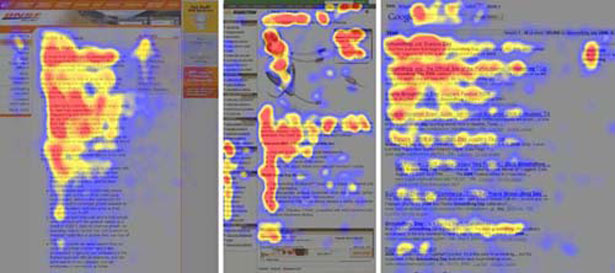
Eye tracking studies (shown above) conducted by Jacob Neilsen show that users read in an F-shape, the first two paragraphs are the most important, and sub-headings and lists stand out from paragraph text.
- On a similar note, Provide a hierarchy of information - Use headers, lists, and breaks to make information easier to find and read.
- Use White Space - One of the most common web design follies is to try to fit as much information on a page as possible. In fact, the opposite should be true. More white, or blank, space looks better and makes sites easier to read.
- And last but not least, test for usability - You become so intimately familiar with your site in the process of making it that you might miss problem areas for users simply because they seem obvious to you. Often you won't know about usability issues until your test subjects find them for you.
What is Responsive Web Design?
Responsive web design is certainly one of those things that falls under the umbrella of usability, but is so important that it deserves its own section. Making a website "responsive" means designing your website so that it is adaptable and accessible to users on any device.
Think of the multitude of devices out there today: computers with large-screen monitors, big laptops, small laptops, tablets,
e-readers, phones, and many more. If users from any of these devices cannot get the information or achieve the tasks they need,
your website loses a lot of effectiveness. The below chart shows the growth of mobile phone use in accessing the Web.
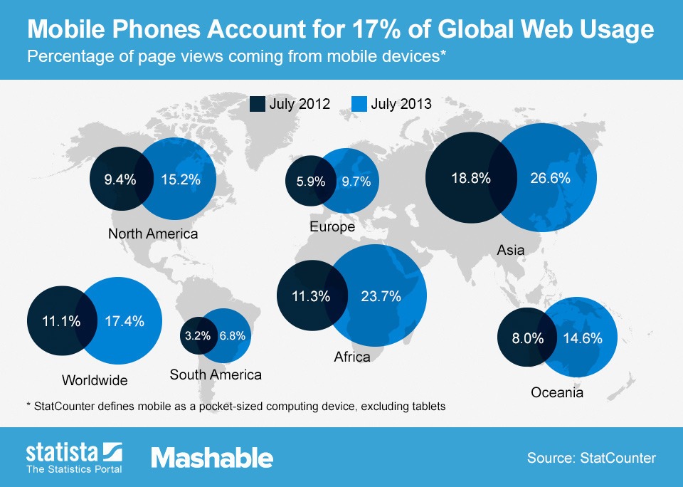
And that's just phones.
What does a responsive website look like?
Well, it's much easier to show what a non-responsive website looks like. For example, the CS110 Schedule page
of the old website (before Spring 2014) was not responsive:
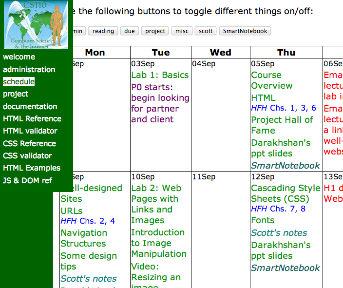
At smaller screen widths, the user cannot see the whole schedule at once, which is a problem in and of itself. And because the menu on the side is fixed, it overlaps the menu when you try to scroll sideways to see the rest of
the
schedule. The spigotdesign.com
site, however, is designed to be responsive. Try visiting the site
and re-sizing your browser. The following image shows what the site
looks like on a computer, on a tablet, and on a mobile phone.
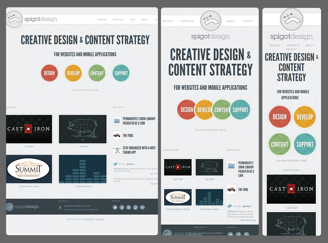
Elements have been adjusted in size, moved, and even taken away entirely to adapt for different screen sizes. There are really no hard-and-fast rules for making a website responsive. Much of the process of responsive web design involves designing for big screens, testing for different screen widths, and then adjusting your site accordingly. There are, however, some helpful guidelines for designing for smaller screens.
Guidelines for Designing For Smaller Screens (Tablets, E-Readers, Phones, etc.)
- Resize your content to fit on the screen. - If your content does not fit horizontally, stack it vertically, since there is often more vertical space than horizontal space on these types of devices.
- Remove non-essential content - There is some content that users simply may not need when they are browsing on-the-go. Do not be afraid to remove it if it is taking up valuable screen space.
- Increase font size for legibility - It's already difficult to read on mobile devices. Increase the font size to make your site easier to read.
- Make your links and buttons recognizable and clickable - On touchscreen devices, users are using their fingers to click on links instead of a mouse or trackpad, which can be much less accurate. Increase the size of your buttons and links to account for this.
- Whitespace is still important - Resist the urge to fill the screen space since there is so little of it. As with before, this blank space is still important for the overall readability of your site. Increase your margins and padding, if need be.
How do you adapt for responsiveness?
In order to adapt your website to different screen widths, you first must determine your screen's width, then apply certain rules to
your screen under those circumstances. This is done with a media query. A media query is like an if statement in
JavaScript: if your screen is within a certain range, then apply the CSS rules.
Exercise 1
Read the CSS code below and try to guess what will happen to the div elements of class colorblock,
if you resize the page.
    .colorblock {
        width: 100%;
        max-width: 850px;
        height: 30px;
        background-color: red;
      }

      @media screen and (max-width: 700px) {

        .colorblock {
          background-color: blue;
        }

      }

      @media screen and (max-width: 500px) {

        .colorblock {
          background-color: green;
        }

      }
Then, try it out by playing with this page.
Notice that:
- The media queries comes after the original CSS definition. This is so that the later rules can overwrite the previous ones.
- Only the rule in question (in this case, the background color) is changed. All the other original rules still apply.
In the example above, 700px and 500px become special numbers. In the web design world, these are called breakpoints, since they are screen widths where things on the page change. In general, it is good to have as few breakpoints as possible - it can be confusing if things are constantly changing when you resize your screen, and difficult to maintain. Thereis a lot of debate in the web design world about the best breakpoints for your media queries, but, generally, safe bets are 768px and 480px, the screen widths of an iPad and an iPhone.
Other Responsive Fixes
On another note, you'll notice that the div itself is responsive and resizes along with the screen. This is because we gave it a 100% width and a max-width of the largest pixel size we want our element to be. This is a great trick for making images responsive. Percentage widths are one of your biggest tools in making a site responsive; instead of fixed-pixel widths, use percentages of the screen size. Other tricks include:
- Remove things using
display: none - Set inner elements to be percentage widths of outer elements (for example, four blocks in a row on the page to each have 25% width, adding up to 100% width in total)
- Load lower image resolutions as narrower screen widths
- Arrange things vertically instead of horizontally, by switching from
display: inlineordisplay: inline-blocktodisplay: block
Side Note
display: inline-blockis a useful CSS rule we didn't talk about in class. It allows elements to act as block elements in terms of size and containing other elements, but is treated like an inline element for display purposes, allowing it to line up side-by-side with other inline elements.
Besides that, just try things! You'll never know what works until you spend some time finding out what doesn't first.
Example: Let's Fix the CS110 Schedule
Here's a responsive version of the CS110 schedule. Try resizing your browser, then read the explanation.
Here's a fancier responsive version, which automatically generates day labels in the narrow version.
Example: Let's Adapt a Page to be Responsive
Start with this non-responsive page, and use media queries to make it adaptive to smaller screens. Your solution may look something like this page.Testing
Google Chrome Developer Tools allow you to emulate the screens of many devices so that you can check how your website will look like in such devices. To get to this emulation mode, once you open Inspect Element, toggle the Emulation button (on the left side of Inspect Element tab name). Then you can use the drop-down menu to choose any device you'd like to test.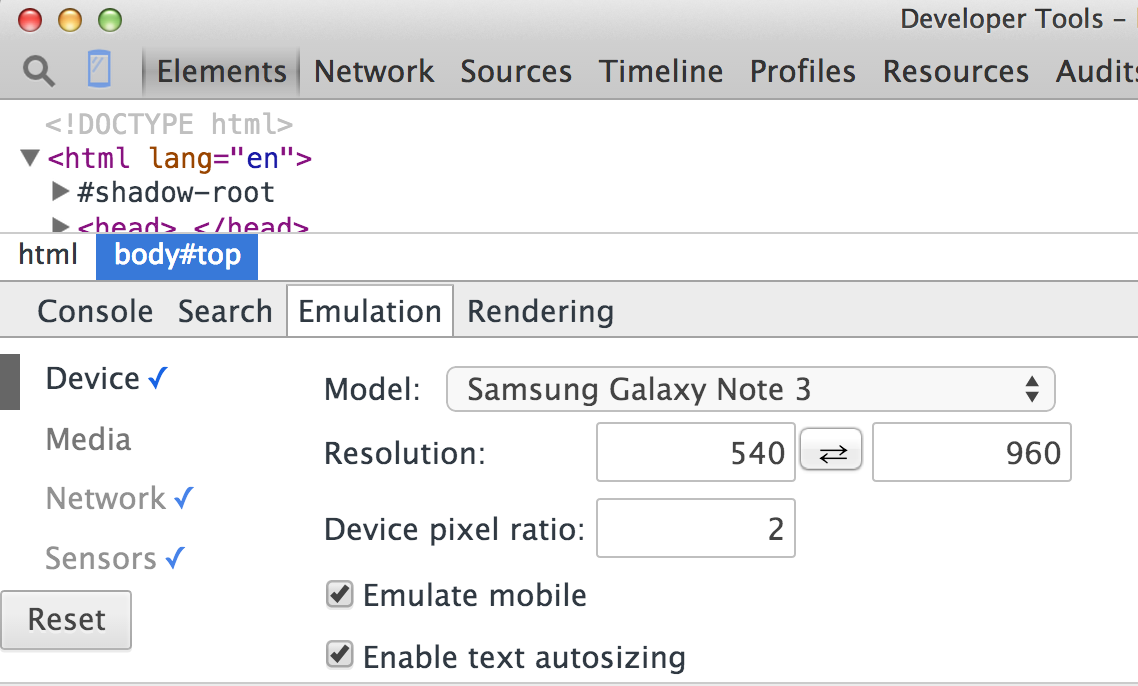
More Resources
You're probably thinking by now, Wow, this sounds like a lot of code! But don't be afraid! There are tons of frameworks on the Web that make creating responsive websites easy. Most of these are built on something called a fluid grid, which, in most cases, takes care of the responsiveness for you. One of my favorites, and an industry standard, is Bootstrap, a framework built by two software developers at Twitter. If you plan on continuing in web design after this class, or if you're just interested, check it out.
Futher Reading
- CS220 (Human-Computer Interaction), discusses many of the things talked about in this lecture more in-depth, and lets you design for iPhones and conduct usability studies, among other things. Check it out!
- This article from Smashing Magazine has a more in-depth description of media queries, especially in designing for mobile.
- This article from Treehouse provides a good
overview of the what, why, and how of responsive web design.