CSS Selectors
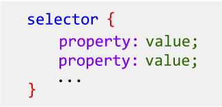
When we introduced CSS rules, we described the generic form of a rule as in Figure 1. At the head of the rule is the selector, followed by a series of property and values pairs enclosed in curly braces.
Today's focus is on the selector. The selector
indicates which element(s) the rule will apply to. So far, we
have only seen a tag as the selector, so a rule would
style all paragraphs (P elements), or all EM elements, or
whatever elements correspond to that tag. In this reading, we
will expand the set of selectors.
CSS and ID
Back in the reading on URLs, we
learned about giving an element an ID (short
for identifier, like a driver's license is a kind
of ID card
). Because an ID is unique on a web
page, it can be the target of a hyperlink. For example, the
title of this section (see the H2 element just before this
paragraph) has an ID of css_and_id, and so the
relative URL for this section is
http://css-selectors.html#css_and_id.
(Try it!).
In addition, an ID can be used as the selector in a CSS rule. Thus, the following rule was used to make that H2 section header teal:
#css_and_id {
   color: teal;
}
Notice the syntax here: the ID is preceded by
a # symbol (pronounced hash,
or sharp
sign,
or pound sign
, depending on your awareness of
twitter, your musical training and your age).
The ID selector picks out the element with that ID,
and only that element, to apply the style to. But
what about the rule that sets all the H2 elements to light
blue, namely this following? (Later, we'll learn about
the #2EA9D3 code, but for now, trust us that it
means light blue)
h2 {
   color: #2EA9D3;
}
The conflict is resolved by using the more specific rule, which is the one with the ID. You're probably not surprised at that.
CSS and Classes
One drawback of using an ID is that an ID is unique, so you
can only style one element using an ID. Suppose we have various
elements on our page that are important, and we want to style
them differently from non-important elements. We could number
them important1, important2, and so
on, but that would be unbearably tedious. Instead, we want to
describe a kind or category of element, which CSS calls
a class of element.
An example will help. Suppose we have a grocery list. We're
actually out of some critical items, so those have been given
the class important:
- milk
- bread
- apples
- bananas
- toilet paper
- soap
Here's the source code:
<ul>
    <li class="important">milk
    <li class="important">bread
    <li>apples
    <li>bananas
    <li class="important">toilet paper
    <li>soap
</ul>
You can see that class works just like ID, in that you specify
it as the value of an HTML attribute. Note that, just like ID,
you as the author of the web page get to decide what the
ID or class is. If you want to label them critical,
or crit or whatever, that's your choice.
Now let's turn to the CSS side of things. The important items in the list above got styled using bold red using a CSS rule like this:
.important {
   color: red;
   font-weight: bold;
}
First, note the syntax of the selector. The name of the class
is preceded by a dot or a period (a full stop
if you're
British). Otherwise, it works just like an ID: all the elements
with that class get that style rule applied.
ID, Class, Abstraction and Modularity
In this discussion of ID and class, we can see the concepts of abstraction and modularity that we will return to many times in this course. First of all, the ID and class allows us to separate the structure and semantics of the page (which belong to HTML) from the presentation or style of the page (which belong to CSS). Separating different aspects is part of modularity. The name that we choose for the ID or class provides the semantic label, and the CSS rule then applies some style to those labelled element(s).
A related aspect of this modularity is how to choose the
names. Suppose that instead of choosing important
as the class name, we had chosen bold_red. It's
about the same amount of typing, and it's much clearer as to
what the class name does, right? However, trouble arises when
we change the site. Suppose have a big website, with hundreds
of pages and thousands of elements
labeled important. Cleverly, you have one external
CSS file that every page uses, so the CSS rule is just in one
place, like this:
.boldred {
   color: red;
   font-weight: bold;
}
One day, the boss comes in and
says I'm tired of the bold red; it's too scary. Change them
all to medium maroon.
You change the rule as follows:
.boldred {
   color: maroon;
   font-weight: medium;
}
and you're done in five minutes, with all the hundreds of
pages instantly getting the new rule. The boss thinks you're a
wizard. This shows the power of modularity — in this case,
specifying something in one place instead of copy/pasting.
However, you now have a website
where class="boldred" changes the contents to
medium maroon. At best, that's confusing and misleading.
The better approach is to name things by what they mean rather than by what they do. That's the power of abstraction. It's not always possible to come up with a good name, but it's worth trying to. You can read more about good class names.
ID versus Class
Students often wonder about what the difference is between a class and an id, and when to use each one. The key is uniqueness: an id must be unique, while a class describes a kind/type/category of element.
For example, there might be many occurrences of these classes of elements:
- an external link,
- a figure caption,
- a logo graphic
On the other hand, there is probably only one of the following elements per page, so these might have an id.
- copyright statement
- login/logout box
- help button
With ID and class as tools, we can create as
many hooks
for styling as we want. In principle, every
single element could have its own ID, and we could give it a
custom style. However, that would be tedious and
confusing. There's a better way, which we turn to now.
Descendant Selectors
A descendant selector creates a style rule where the
elements are chosen based on where they are in the hierarchy of
the page. Remember that an HTML document can be modeled as a
tree. At the root is the <html> element, with
all other elements as descendants, grouped in different
families. Chrome's
Inspect Element gives a very good depiction of the tree
corresponding to the document.
Let's start with a motivating example. By default, hyperlinks are blue and underlined. That might be what you want for most of your page, but in the nav bar you want them to be, say, green and not underlined. Here's one way:
<nav>
  <ul>
    <li><a class="navlink" href="home.html">Home</a>
    <li><a class="navlink" href="about.html">About Us</a>
    <li><a class="navlink" href="contact.html">Contact Info</a>
  </ul>
</nav>
You can combine that with the following CSS rule:
.navlink {
    text-decoration: none;
    color: green;
    background-color: gray;
}
That's not too bad, but supposing that you also want to
adjust other elements inside the NAV (say removing the bullets
from the UL), you'd have to add more IDs and classes. You can
see that this is tedious and annoying. You really want to
say stuff inside the NAV is styled differently.
For
that, we can use
descendant selectors, meaning that all descendants of
an element are selected. (The UL is a child of the NAV, the
LI elements are grandchildren, and the A elements are
great-grandchildren.) Here's an example:
nav ul {
    list-style-type: none;
}

nav a {
    text-decoration: none;
    color: green;
    background-color: gray;
}
With a descendant selector, you give two
selectors. The first is the ancestor and the second is the
descendant. If you have A B, it means all
elements that match B that are also descendants
of elements that match A. (This can be
generalized to three or more selectors, but that's uncommon.)
In the example above, we used two tags as the
selectors, NAV UL and NAV A, but the
selectors don't have to be tags. Either selector could be any
one of the three basic selectors we know: (1) tags, (2) ID,
and (3) class. For example:
#banner H1 {
    font-size: xx-large;  /* banner header is huge */
}

#copyright em {
   font-style: normal;  /* italic looks weird in tiny font */
}

.appendix h2 {
   color: blue; /* make headers in appendices look different */
}

.appendix .important {
   color: black;  /* since it's in an appendix, don't use red */
}
In practice, you wouldn't use an ID as the second selector, since an ID is already unique and doesn't gain any specificity by adding an ancestor.
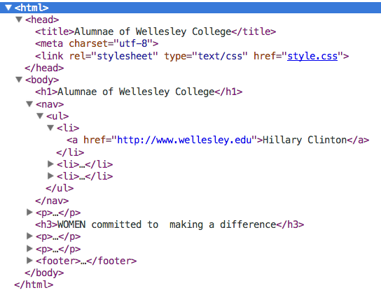
To use descendant selectors effectively, it's important to
keep the tree in your mind. Here is a graphic of a tree from
an example you've seen before:
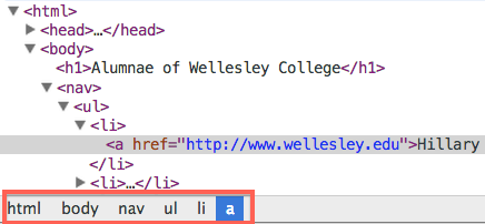
Since the ancestry of an element is important with descendant
selectors, debugging can require being able to easily see the
ancestry of a particular element. Figure 3 shows the path of
elements in which our a element is nested, as
displayed by Chrome's Inspect Element window. This is an
absolute path, starting from the root, html. When
we specify the selector, we can use only parts of such a path,
such as nav ul li a, or simply nav
a.
Pseudo-selectors
There is one more kind of selector that will be important in this class, namely pseudo-selectors. We will look at how to format hyperlinks. As you know, hyperlinks are blue by default, but only when they haven't been visited. Once you've visited them, they turn purple (by default). You can control the style of both kind of link using CSS. You can also control what they look like when you hover over them, and in the moment of clicking on them. There are names for these four states:
a:linkis an unvisited linka:visitedis, unsurprisingly, a visited linka:hoveris when the mouse is over the linka:activeis the moment when the link is clicked
Here's an example of some CSS to style all four states:
#hyperlink-example a:link {
color: orange;
}
#hyperlink-example a:visited {
color: red;
}
#hyperlink-example a:hover {
border: 1px solid blue;
font-size: 2em;
}
#hyperlink-example a:active {
border: 2px solid red;
font-size: 2em;
font-weight: bold;
}
Here's the example in action:
Note that there are ordering constraints among these
pseudo-selector rules; we recommend specifying them in the
order used above. You don't have to specify all of them
(:active, for example, is pretty rare, and with
touch screen devices, :hover is useless).
You can learn more and play with the specifications using this page: W3 Schools CSS Links.
Note that if you don't care about the state of the link,
you can specify the appearance just using the A
tag:
#hyperlink-stateless a {
color: green;
}
Here's the stateless example in action:
Selector Summary
Let's summarize the kinds of selectors that we've learned:
- tag , e.g.,
p,em,li, etc. Such a selector will apply to all elements of this kind in the document. - .classname, e.g.,
.important. Such a selector will apply to all elements that share the attributeclass=classname. - tag.classname, e.g,
h2.important. Such a selector will apply to the indicated elements with the attributeclass=classname. We didn't learn this explicitly, but it's a straightforward variation on the classname idea. - #idName, e.g.,
#main, etc. Such a selector applies to the single element that has the attributeid=idName. - selector descendant-selector, e.g.
nav
          a
. This applies to all descendants of the selected kind that have the selected ancestor. - a:link, a:visited, a:hover and a:active. These pseudo-selectors allow you to style hyperlinks based on their state.
To better understand the different kinds of CSS selectors, refer to the code examples in W3Schools CSS Selectors' page.
More Selectors (OPTIONAL)
There are many more esoteric selectors, and you're welcome to learn them. The following material is optional, and you can stop here. Read on if you're curious.
Grouping Selectors
If you have a rule that you want to apply to several things, rather
than copy/paste the rule (copy/paste is always bad for
modularity), you can share the rule. Suppose you have three elements on
the page with IDs of harry, ron,
and hermione. If they all have different colors, but the
same font, you could do:
#harry { color: red; }
#ron { color: green; }
#hermione { color: blue; }

#harry, #ron, #hermione {
   font-family: impact;
}
You can see that there's just one rule to specify the font family for all three. All you have to do is list all the selectors, separated by commas. The selectors can be tags, classes, ids, even descendant selectors, in any order.
More Pseudo-Selectors
Pseudo-selectors come in two flavors: pseudo-classes and pseudo-elements.
- A pseudo-class differentiates among an element’s different
states or types. Examples of using states of an element are:
information about link states:
:hover,:visited,:active, about form inputs states::checked,:disabled. Examples of using the type of an element are structural pseudo-classes such as:first-child[see example],:nth-child(odd)[see example],:nth-of-type(n)[see example]. Finally, in CSS3, there is a new pseudo-class known as:not, which negates a rule for the selected element (that is, the rule will apply to all other elements that are not selected). See example. - A pseudo-element provides access to an element’s subpart,
which includes those pseudo-elements that select portions of text nodes,
for instance,
:first-line[see example] or:first-letter[see example].
In CSS3, to differentitate between pseudo-classes and pseudo-elements, the syntax
to refer to them has changed. An element is referred with a double colon. You will see
both examples on the Web, because they are still supported by browsers. Two new
pseudo-elements that are also interesting are ::before and
::after which can be used to add content before or after an element. These
are used when one wants to add icons in front or after certain elements, see
example.